
Giga-Bites Rebrand
Giga-Bites Rebrand
Giga-Bites Rebrand
In my Typography II class, I rebranded a local business of my choice and developed a full set of branding materials. I selected Giga-Bites Café, a gaming-focused café. I used InDesign, Illustrator, and Photoshop for this collection.
Giga-Bites Café is a place where gamers come together to enjoy their favorite games and food. From tabletop classics like Dungeons and Dragons and Warhammer to trading card staples like Yu-Gi-Oh!, Pokémon, and Magic: The Gathering, the café offers something for every kind of player.
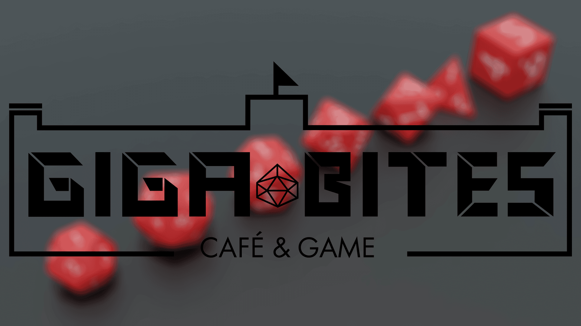
The target audience of this brand is gamers (primarily men) who are between the ages of 20 and 50. For the logo, I wanted to capture the gaming feel by incorporating dice and a castle. The castle represents the fantasy themes found in many popular games. I also designed a custom font for the logo, with blocky letters that reflect the structure of cards and board games. I selected a red and pink color palette to build on Giga-Bites’ existing branding, which features red on its storefront sign and interior walls. I added pink to the palette to make it more playful and inviting. I chose these fonts for the same reason.
For my business card design, I chose to separate the elements of the logo, placing the castle on the back to frame the information. This layout demonstrated that the primary logo without the castle works beautifully as a secondary logo. After this, I decided to implement this secondary logo across additional branding materials.
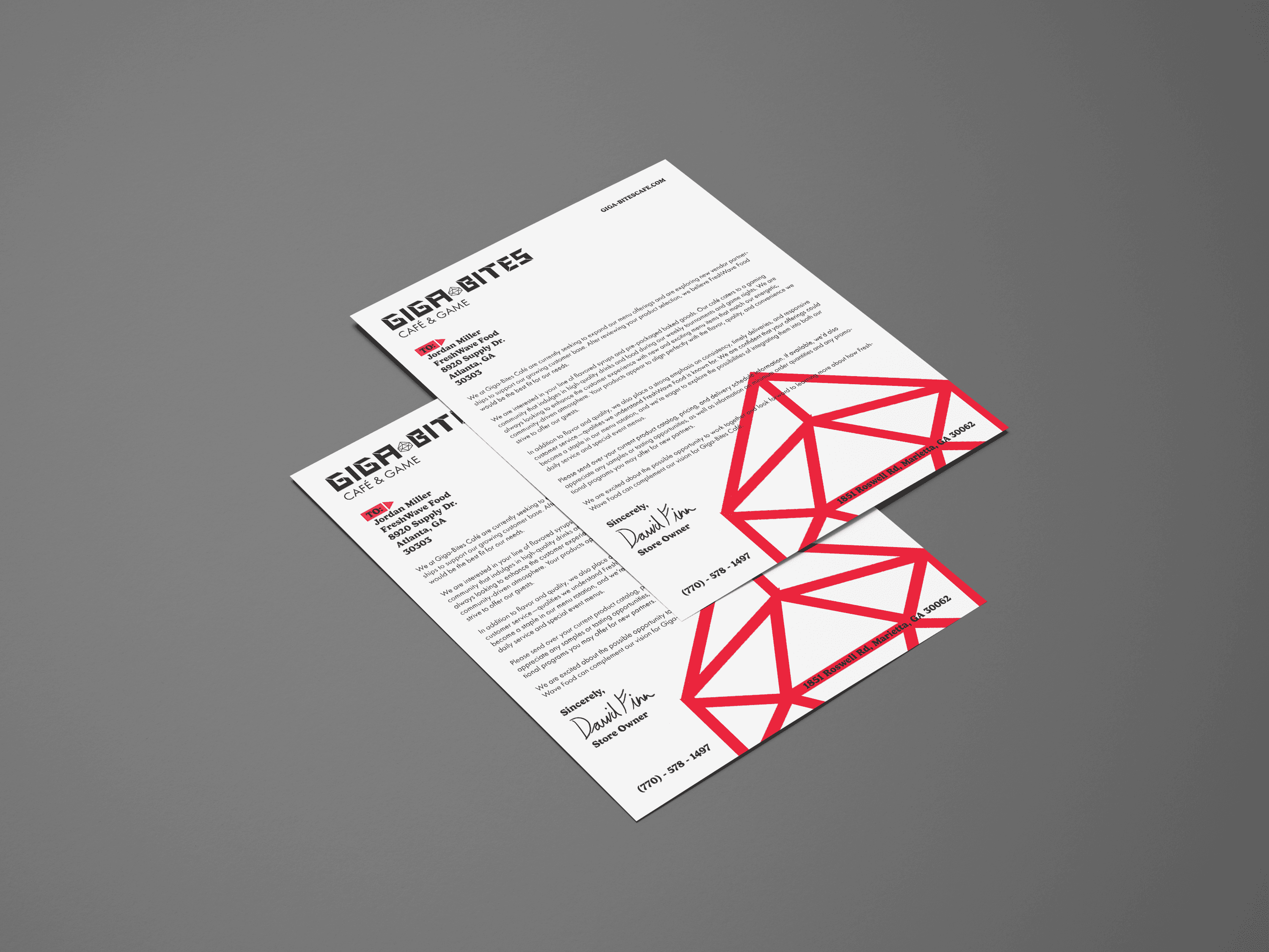
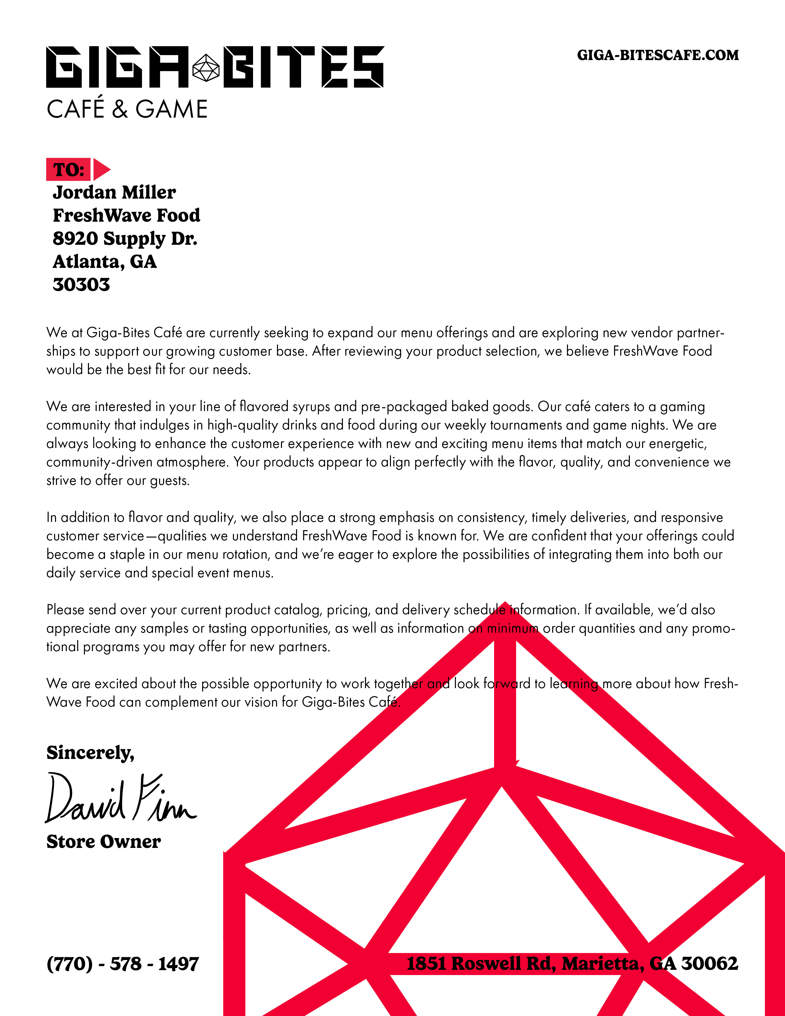
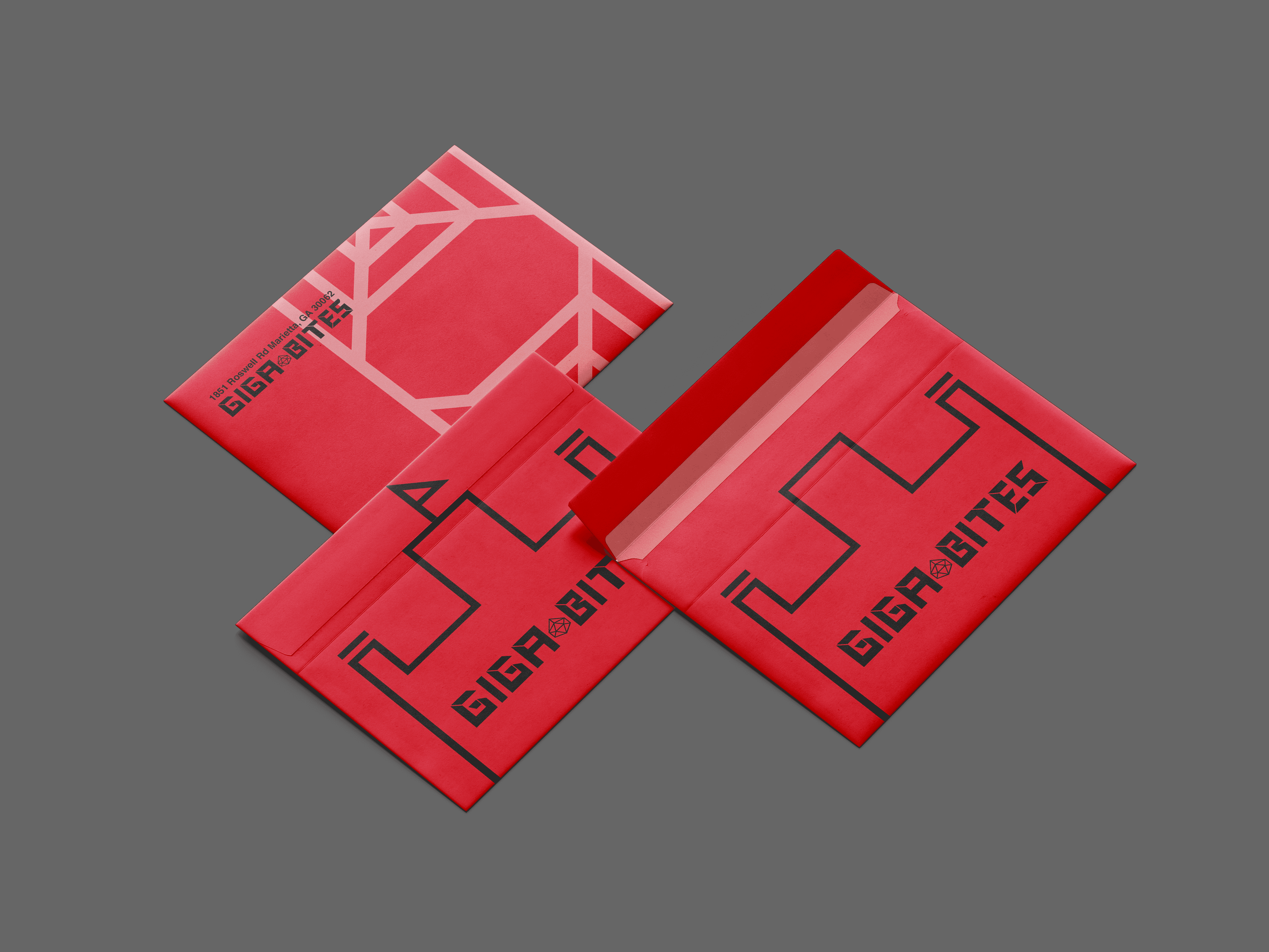
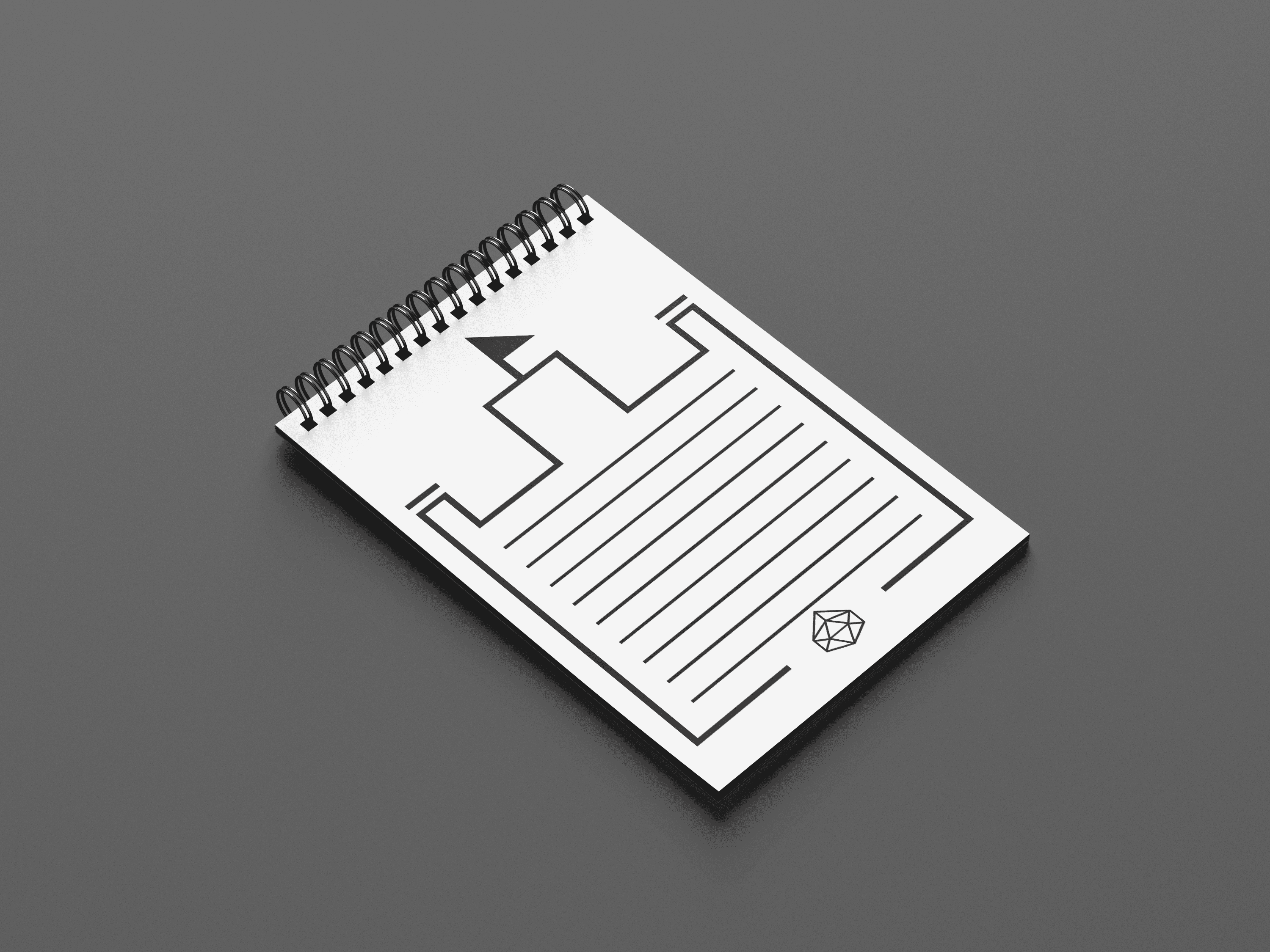
Designing the stationery was one of the most enjoyable parts of this project. Like the business card, I used the castle as a decorative frame on the notepad. At Giga-Bites, employees write down customer orders by hand, so I thought this notepad could serve a practical purpose for them. I also created letterheads and envelopes for the café to use when communicating with other businesses.
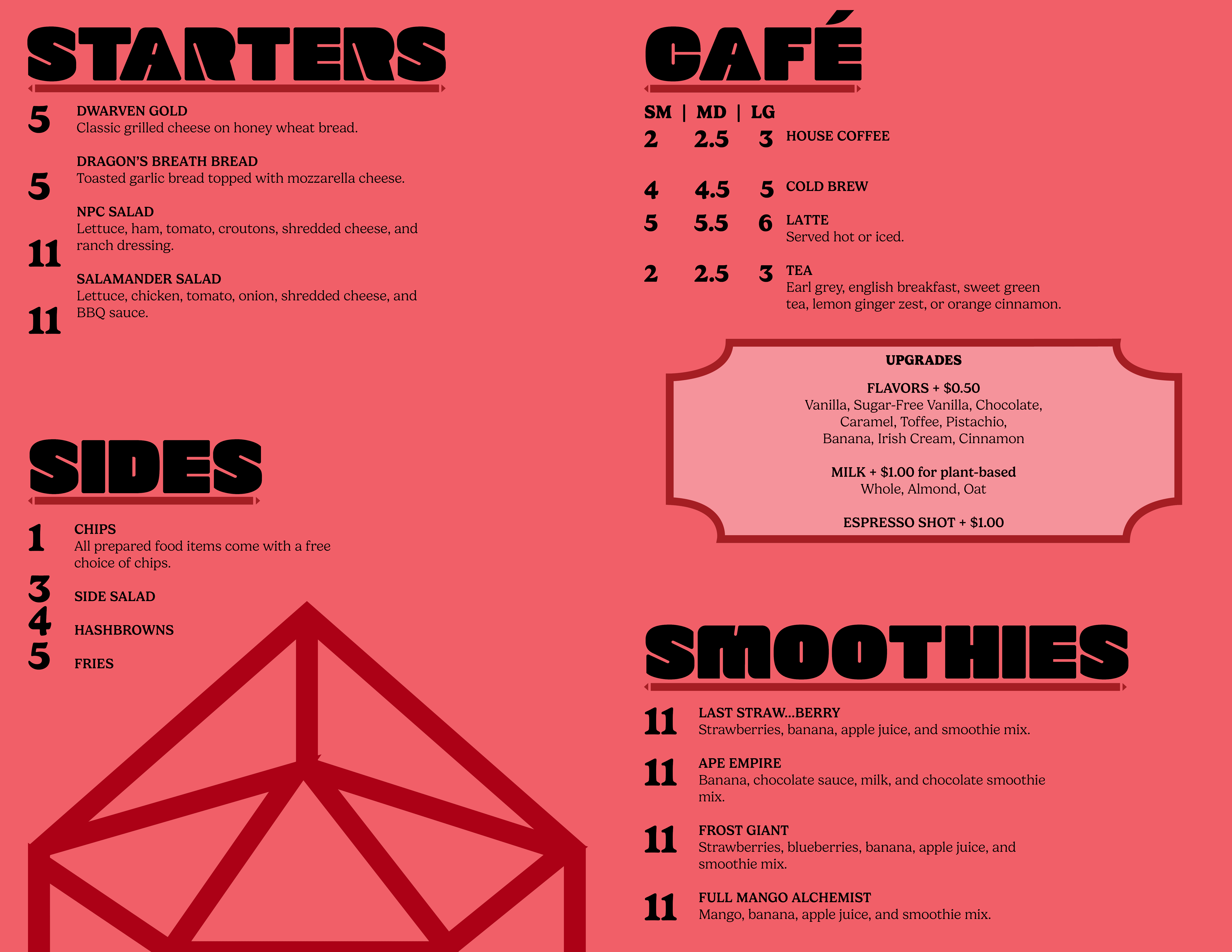
The menu was the most challenging part of this project for me. Giga-Bites’ current menu is very large and a bit disorganized, which made it difficult to fit all the items in a clean and legible way. It took me a while to sort through their menu and reorganize it in a way that made sense to the consumer. For the cover, I added a geometric design that matches the style of the dice featured in the logo to tie in with the branding. For the inside, I made the prices bold to align with the style of the headers.
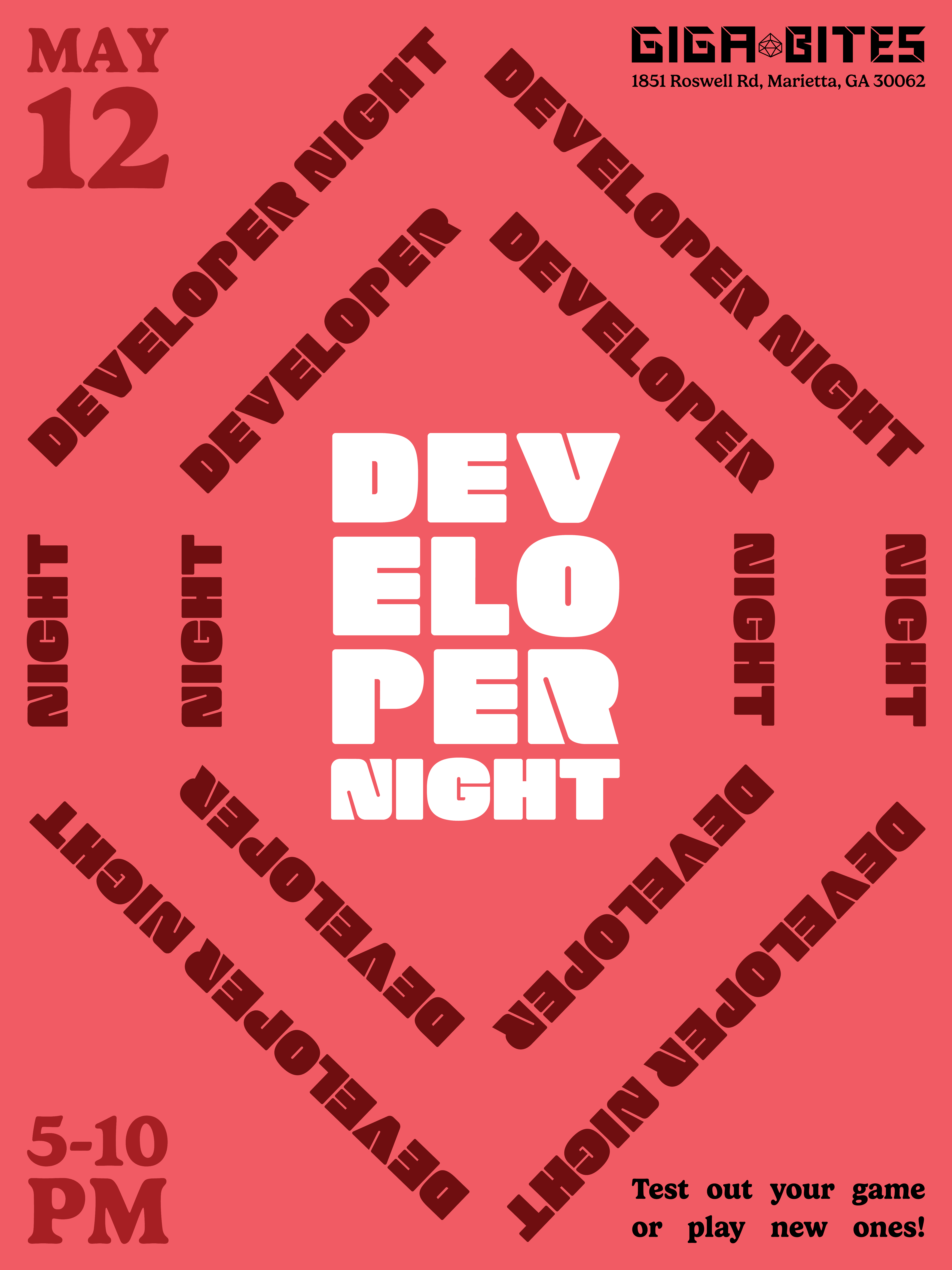
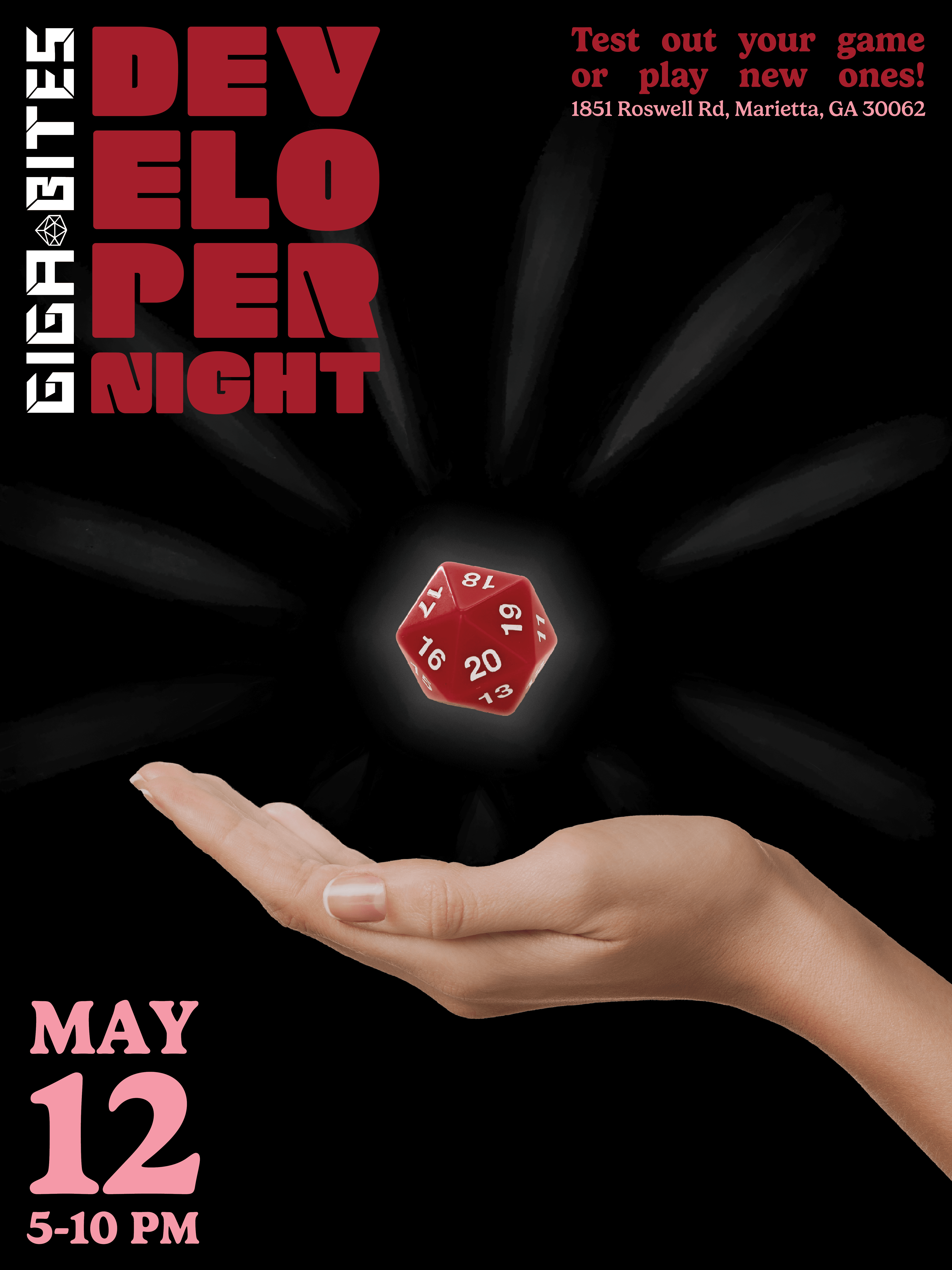
These posters promote an event that was held at Giga-Bites. For the typographic poster, I designed the text to form the shape of the dice used in the logo. For the mixed media poster, I used an image of a hand levitating a die to symbolize the focus of the event: game developers and their creations. It shows that they will hold the power that night!
For the brand items, I designed a card box for players to store and carry their game cards. Since many players bring decorative card boxes to tournaments, I felt this would be a practical product, especially since Giga-Bites hosts weekly trading card tournaments.


Contact
In my Typography II class, I rebranded a local business of my choice and developed a full set of branding materials. I selected Giga-Bites Café, a gaming-focused café. I used InDesign, Illustrator, and Photoshop for this collection.
Giga-Bites Café is a place where gamers come together to enjoy their favorite games and food. From tabletop classics like Dungeons and Dragons and Warhammer to trading card staples like Yu-Gi-Oh!, Pokémon, and Magic: The Gathering, the café offers something for every kind of player.
The target audience of this brand is gamers (primarily men) who are between the ages of 20 and 50. For the logo, I wanted to capture the gaming feel by incorporating dice and a castle. The castle represents the fantasy themes found in many popular games. I also designed a custom font for the logo, with blocky letters that reflect the structure of cards and board games. I selected a red and pink color palette to build on Giga-Bites’ existing branding, which features red on its storefront sign and interior walls. I added pink to the palette to make it more playful and inviting. I chose these fonts for the same reason.
For my business card design, I chose to separate the elements of the logo, placing the castle on the back to frame the information. This layout demonstrated that the primary logo without the castle works beautifully as a secondary logo. After this, I decided to implement this secondary logo across additional branding materials.
Designing the stationery was one of the most enjoyable parts of this project. Like the business card, I used the castle as a decorative frame on the notepad. At Giga-Bites, employees write down customer orders by hand, so I thought this notepad could serve a practical purpose for them. I also created letterheads and envelopes for the café to use when communicating with other businesses.
The menu was the most challenging part of this project for me. Giga-Bites’ current menu is very large and a bit disorganized, which made it difficult to fit all the items in a clean and legible way. It took me a while to sort through their menu and reorganize it in a way that made sense to the consumer. For the cover, I added a geometric design that matches the style of the dice featured in the logo to tie in with the branding. For the inside, I made the prices bold to align with the style of the headers.
These posters promote an event that was held at Giga-Bites. For the typographic poster, I designed the text to form the shape of the dice used in the logo. For the mixed media poster, I used an image of a hand levitating a die to symbolize the focus of the event: game developers and their creations. It shows that they will hold the power that night!
For the brand items, I designed a card box for players to store and carry their game cards. Since many players bring decorative card boxes to tournaments, I felt this would be a practical product, especially since Giga-Bites hosts weekly trading card tournaments.
Contact
Contact